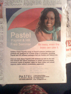
 Pastel in Zimbabwe published an advert a few months ago to get you to attend their Payroll & HR Free Seminar. Now Pastel is a great product no doubt, but there was a huge problem with the advert… one we see all to commonly in Zimbabwe advertising…the wrong picture.
Pretty as she is, the picture of the girl makes no sense, whatsoever. Then when you read the caption “So easy, even the boss can use it” the picture makes even less sense… but more importantly it adds no value to the message they want to communicate which presumably is the seminar.
Why does this happen?
- Companies are often afraid to place text only adverts because they may look too boring and not grab anyone’s attention. Not always true. some of the best print marketing includes no pictures at all.
- Adverts are typically designed by graphic artists who don’t feel they’ve got an advert, until the advert has got
graphics. Completely understandable… artists think art. Unfortunately there is a difference between art and advertising.
Here’s a simple rule of thumb to remember when it comes to pictures in advertising:
ONLY ever use a picture when it would better communicate your message than words in the same amount of space would do.
Why?
- Because you’re paying for space, make sure every picture you use is earning its space – or else replace it with captivating words.
- Because the wrong picture can confuse your reader or dilute the impact you would have had without it.
- Because pictures are often more of a distraction to an important announcement than actually aiding it. This very often true for those who attempt to use sex to sell.
I’ll say it again
ONLY ever use a picture when it would better communicate your message than words in the same amount of space would do.
This is especially true when you’re paying for space.


 Max Soutter
Say something!